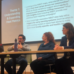
Hi everyone, and welcome back to another week of Urban Heat Mapping! We have started to analyze the first couple of weeks of September and we are excited to share our results with you.
So far September has felt pretty mild after a hot July and August. When looking at data collection on Sept. 7, it is clear that it was a relatively cooler day with a high of 72ºF in the Chapel Hill/Durham area. These are temperatures we normally see in mid-October! This drop in temperature comes after a weekend of rain and clouds, cooling off the air around us. It was definitely some much needed relief after the periods of extreme heat we experienced during the previous month. Even though it is unseasonably cool for early fall, hot days are not fully out of the picture yet, as just the day before data collection (Sept. 6) the high was 92ºF in the Chapel Hill/Durham area.
Without further ado, let’s dive into the data!
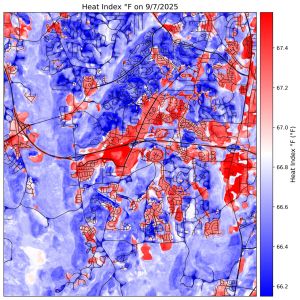
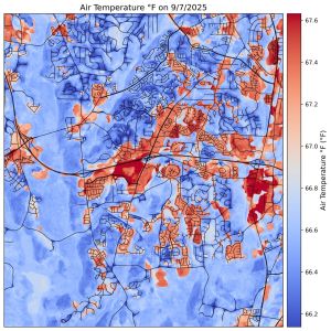
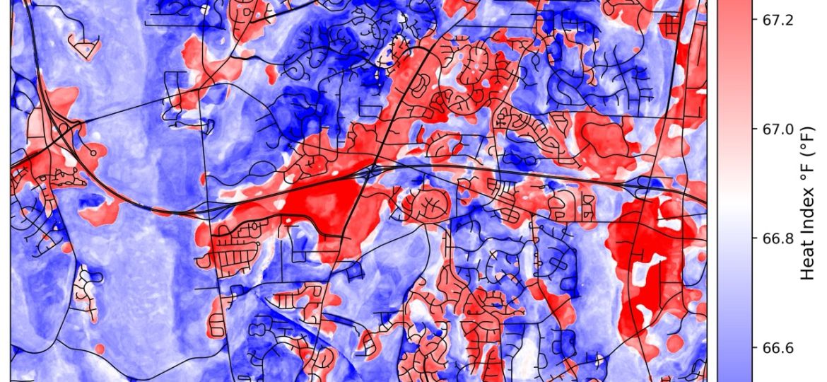
The figure on the right shows air temperature for Durham, NC in ºF while the figure on the left shows the heat index for Durham, NC in ºF. The main difference between air temperature and heat index is that heat index accounts for relative humidity as well as air temperature, giving a temperature that is closer to what it actually feels like outside. Based on both figures, it is obvious there are extreme hot spots in certain areas, especially urban centers such as the Streets at Southpoint.
Cooler weather is great for back to school, and what comes with back to school season? Sports!
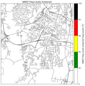
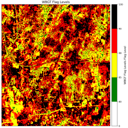
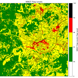
The figure above shows Wet Bulb Globe Temperature (WBGT) Flag levels for Durham, NC. Based on these figures, Sept. 7 was almost a perfect day for practice! The entire area of interest was in white flag levels meaning low risk for heat related illnesses. This map is extremely important for coaches with teams that practice outside such as soccer and football. Understand flag levels is one of the best ways to keep yourself and your athletes safe and healthy.
Not only is this information relevant to outdoor athletes, it is also important for everyone in the community, especially those who work outside such as construction workers or linemen. Some of the best ways to reduce your risk of heat related illnesses are to stay cool and stay hydrated. Of course this is easier said than done, but listen to your body! Though the cooler weather was a great relief from the days of extreme heat in August and early September, we must still be vigilant in paying attention to WBGT flag levels and the heat index to keep us safe as hot days still are not fully out of the picture quite yet!
I hope that this showed how and why our heat research can still be relevant on cooler days! If you have any questions feel free to ask and we will do our best to respond. We greatly appreciate this community and value any insights you may have!